EDJBA Brand Refresh
Brand refresh proposal for the 'Eastern Districts Junior Basketball Association' across digital, web, and merchandise.

Problem
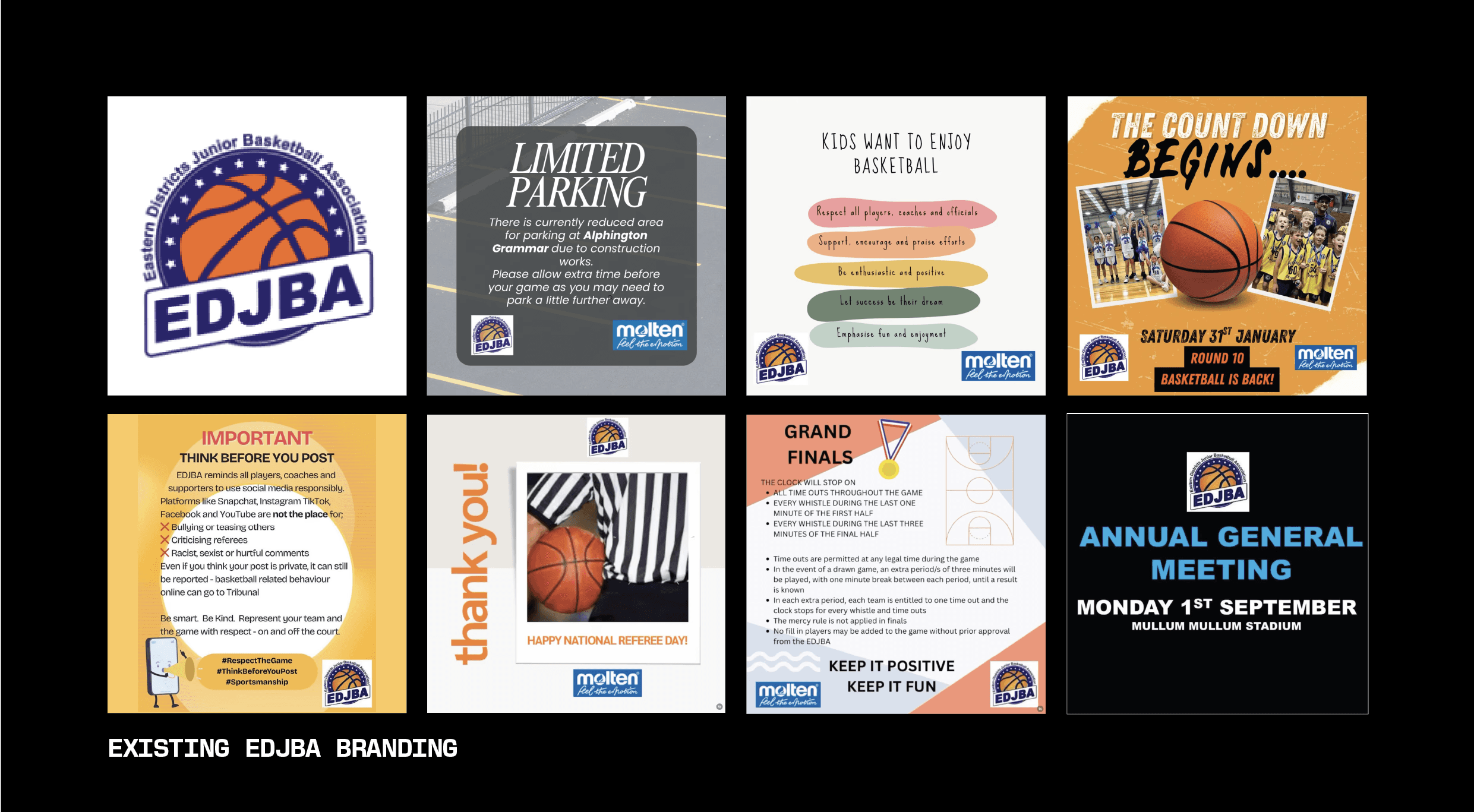
The current EDJBA brand has a variety of issues including poor scalability, low resolution non-adaptive assets, dated and inconsistent social media graphics, legibility and accessibility issues, and the lack of a supporting brand toolkit (beyond the logo).
Solution
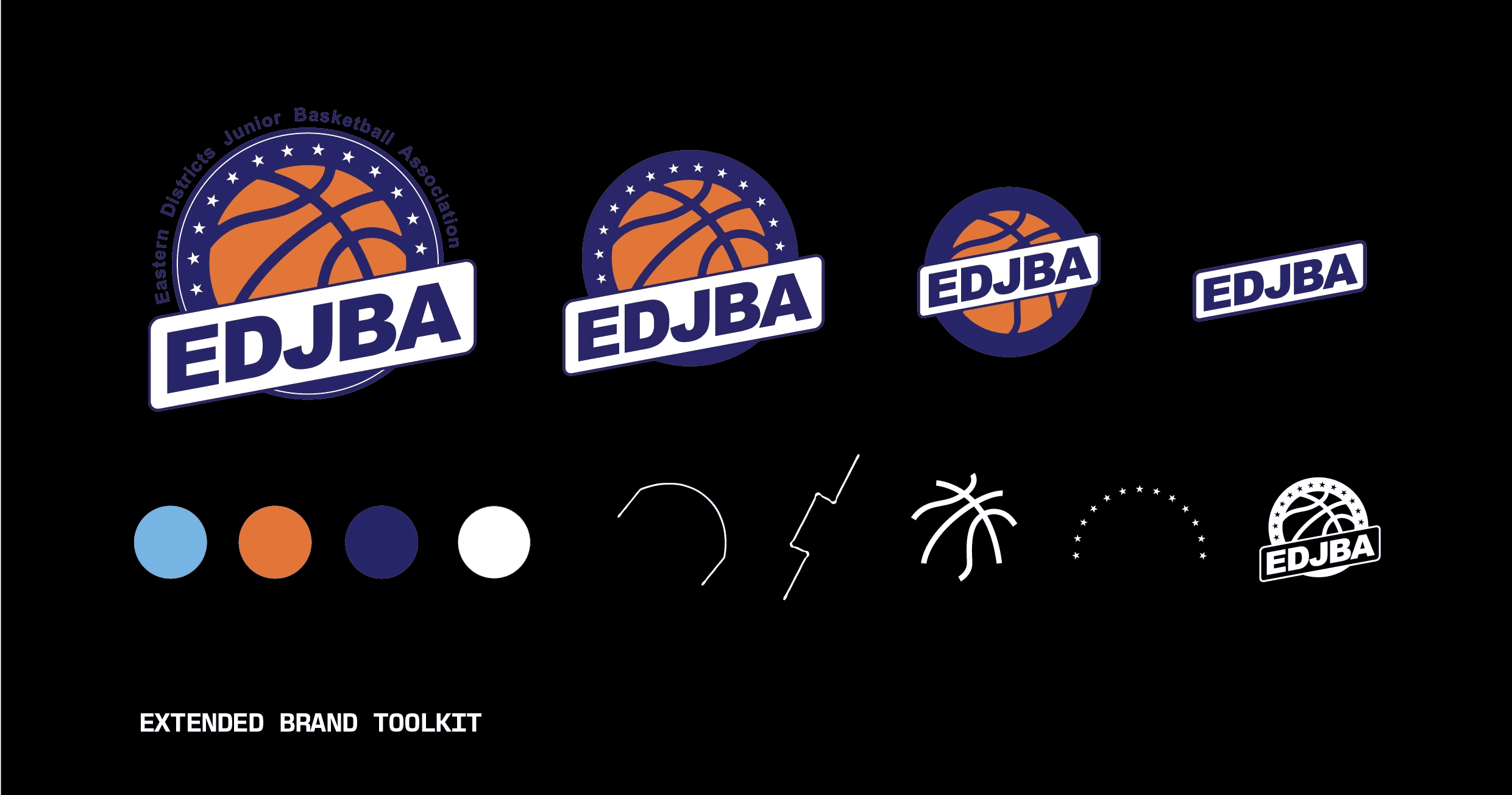
Modernised the brand in scalable vector format, broke exisitng logo into a series of responsive variations to enhance legibility, built a supporting system of brand elements, and crafted a consistent and strategic visual language focusing on brand voice.
The Process
The strengths pulled from the current brand mark included the vibrant complimentary colour palette, basketball and star imagery, and strong hero typography, all of which boldly communicate excitement and are recognised by the audience. Weaknesses included legibility issues with the micro typesetting around the border of the logo, a lack of adaptive logo variations, pixelated assets, inconsistent brand voice across social media applications, poor integration of their primary sponsor, and an absence of a broader supporting system of brand elements.
Note: The generic nature of the imagery in the brand mark was deemed appropriate, only due to the brand's role as a parent association which shouldn't aim to compete with the visual identities of their many member associations.
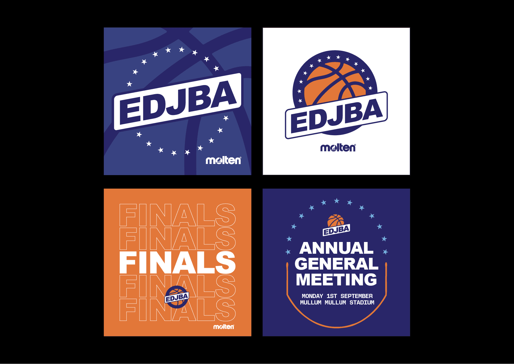
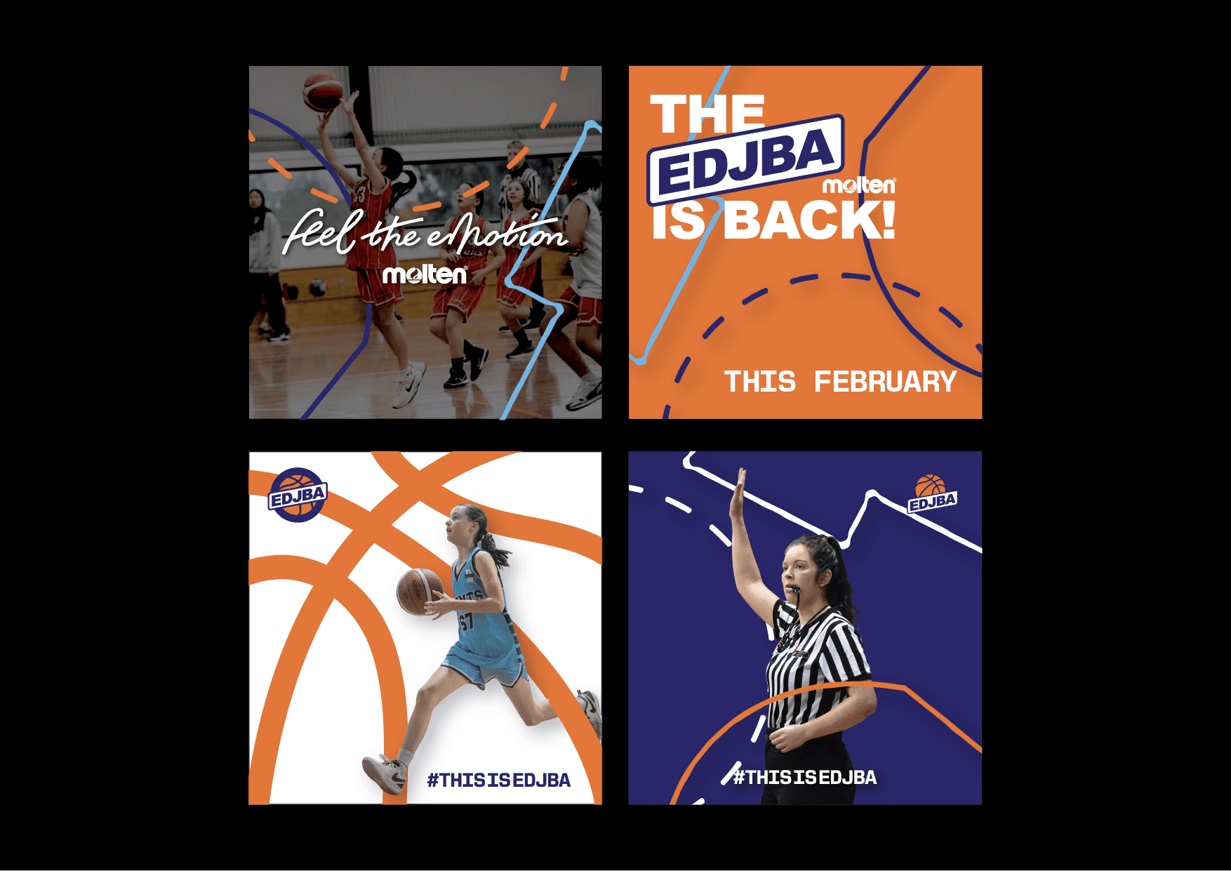
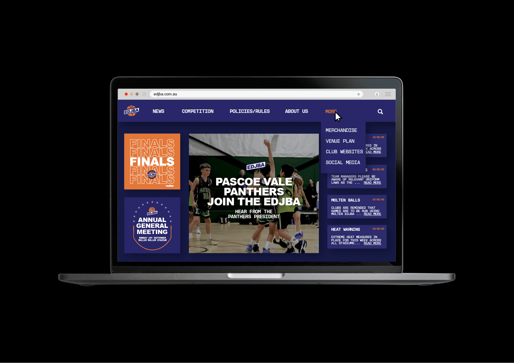
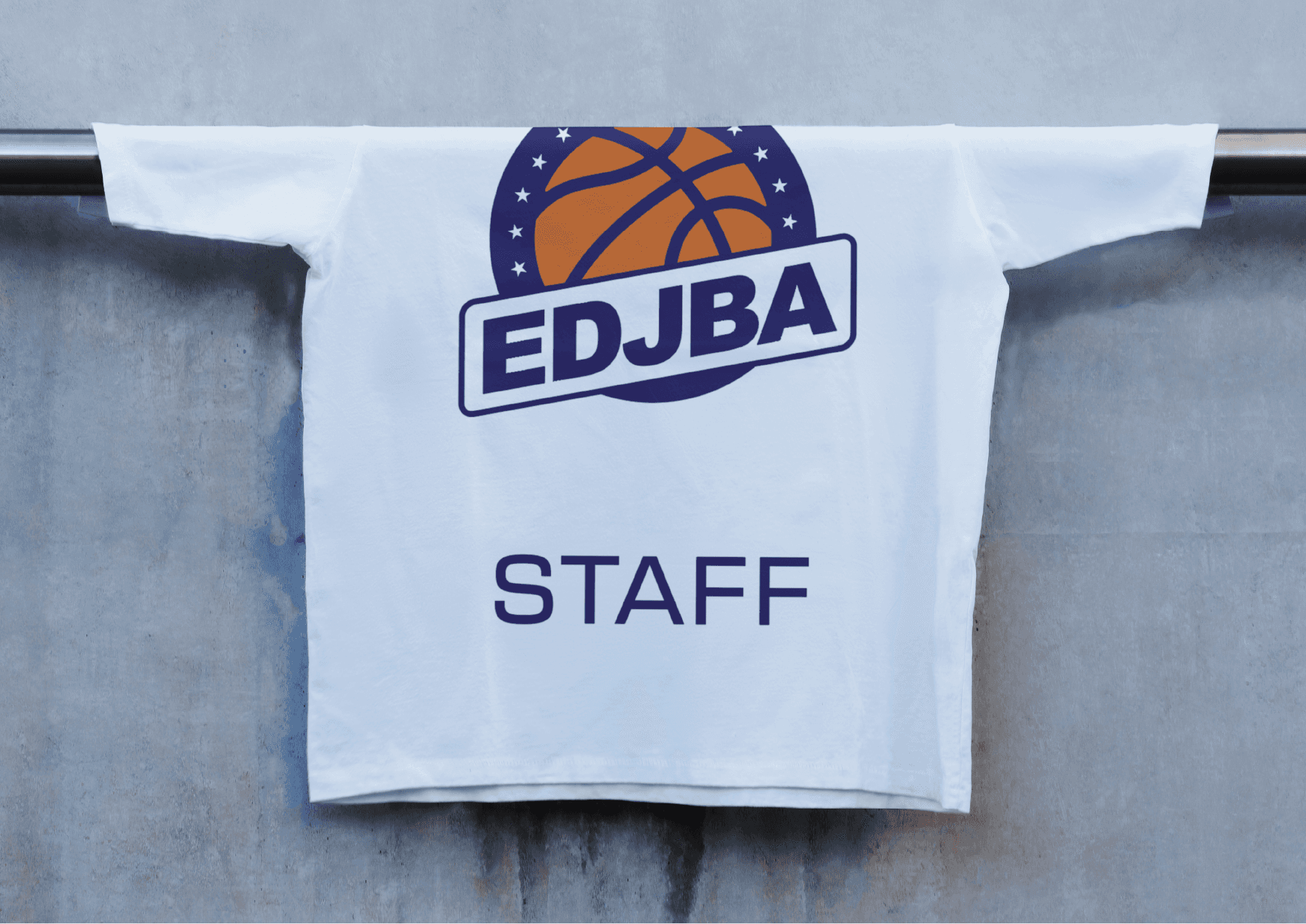
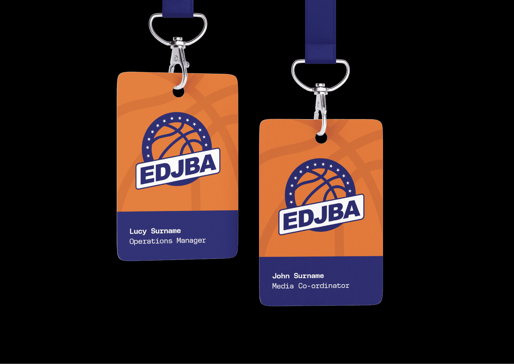
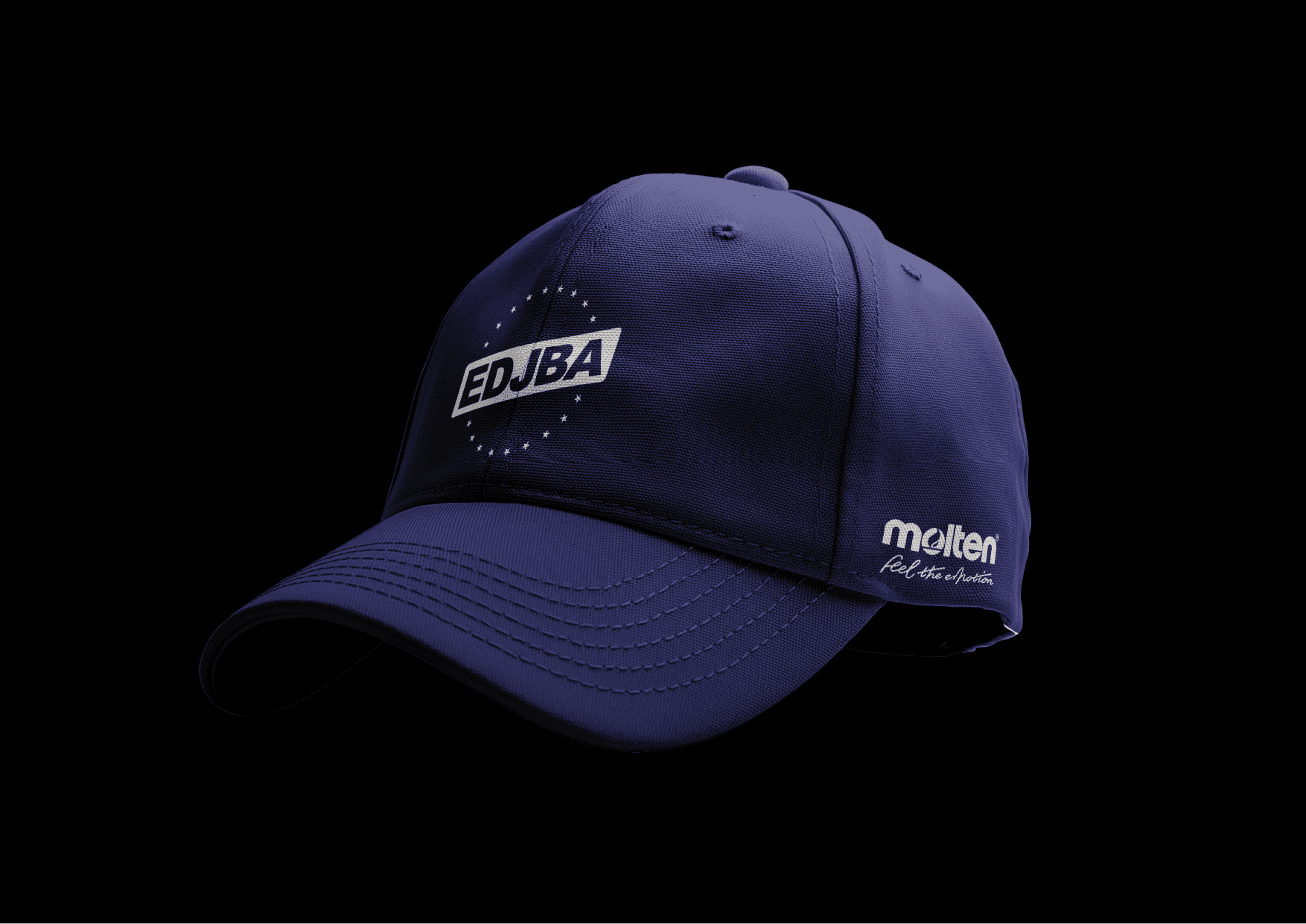
With all of this in mind, I broke the logo down into a series of responsive (vectorised) variations that could be used depending on scale, with consideration to legibility. While the exisiting logo may be used at large scales, most applications don't require the full association name beyond the EDJBA acronym, given the established brand recognition among their audience and the communicative brand imagery. From the existing branding I extracted the stars and basketball pattern, while introducing new court marking visual elements with a welcoming hand-drawn feel appropriate for a junior association. An additional light blue hue was added to the colour palette to be used as an accent for select applications to reinforce a youthful identity.
The revised system of brand elements came together to form a cohesive brand experience that will appeal to a broader audience, adapt better to more contexts, communicate trust and professionalism to stakeholders, and enhance clarity of communication to members.
year
2026
tools
Adobe Suite
category
Branding and Identity